Alignment features are available in both editors.
The column examples shown here are available as preconfigured blocks in the Gutenberg editor. However, you can use CSS or plugins to create columns in the classic editor as well.
Using an Alignment option allows text to flow more freely around an image. Using a Column option provides more defined structure.
Alignment examples (both editors)
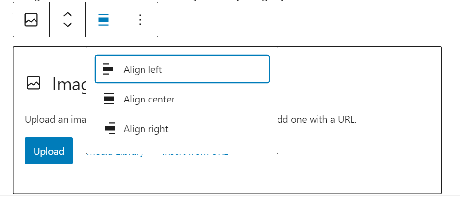
To reproduce this alignment example, a paragraph item is followed by an image item which is followed by more paragraphs. The interface looks a bit different in the Classic editor, but the alignment icons you see when you select an image to align are the same icons.
Classic editor example, aligned right
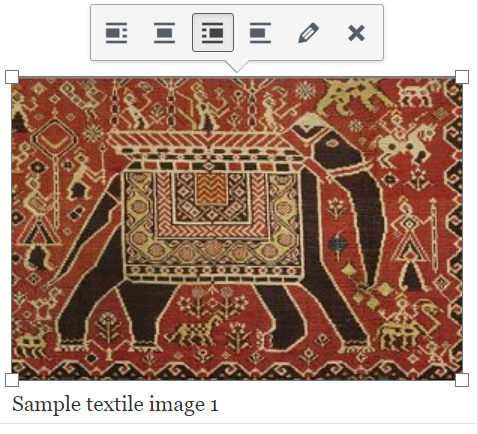
This is the first paragraph block.
This is a paragraph block that’s placed after the image block. However, on a desktop browser, it appears at the side of the image block because of the amount of space the image takes.
Gutenberg editor example, aligned left
The image is set to align left in this example.
This image was dragged a bit smaller using the control dots on the left and bottom in order to allow word wrapping.
The way the image size and position looks in the editing window won’t match up with the way it looks in the live version, so you should use the Preview button to see what the actual size, font, and position look like.
In this example case, this paragraph appears to be three or four paragraphs below the image in the editor window, but still wraps around the side of the caption area in the live version on a full-screen-width desktop browser.
Here’s another paragraph which is positioned above a right-aligned image.
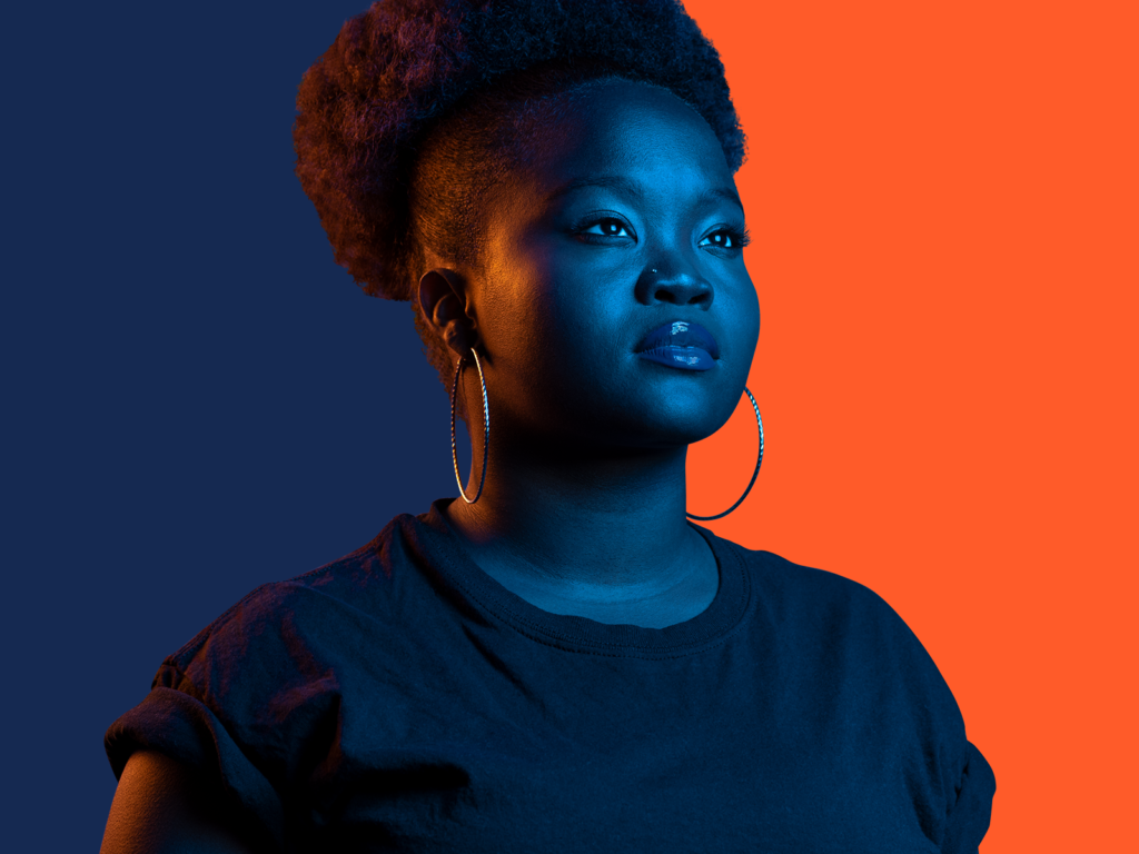
The original of this image is 1600×1200, but it was scaled down using the 25% button in the Block controls.
Also, in the Editor view, the following headline may appear to wrap around the image, but in the live view it will be pushed down to the next free full line of space.
Column examples
Alignment is something that you apply to an image after it’s been placed. In contrast, column blocks are placed first and then text or media are applied in the areas you choose.
You can use plugins or CSS to accomplish column alignment with the Classic editor, but nothing is automatically preconfigured to do so with a point and click. Therefore, the rest of this page discusses Gutenberg’s options.
The Personal Profile – Columns page uses Gutenberg’s Columns for structure. The Personal Profile – Media & Text block page uses a specific Gutenberg block called Media & Text which combines Columns-type layout decisions with some additional visual styling.
When you begin to add a column block, you’re asked to choose which proportions you would like to use.
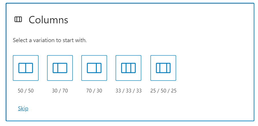
This is a 70/30 column setup with the left column used to contain the image of the column selection interface.
After you’ve chosen your preferred layout, you’ll have some small boxes in your editor window where you can choose what type of block you’d like to place in each column.
If these paragraphs had been using Alignment rather than Column options, they would word wrap to the right of the column selection image above.
This image is positioned using Alignment rather than a column, and this paragraph is inset below the image rather than above. This way you can see that text set above images won’t word wrap, but text set below will.